PORTFOLIO
LOGO design
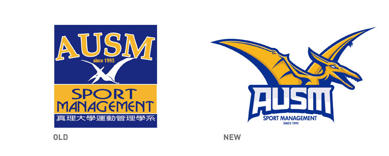
LOGO transform
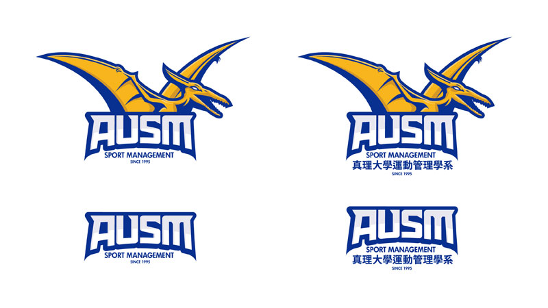
Trademark and logotype
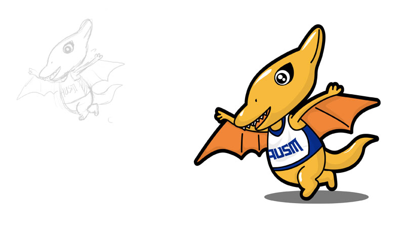
Character design
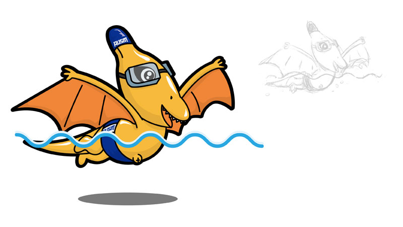
Character design
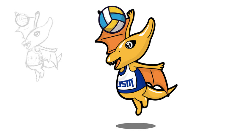
Character design
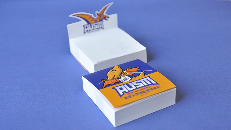
Note paper design
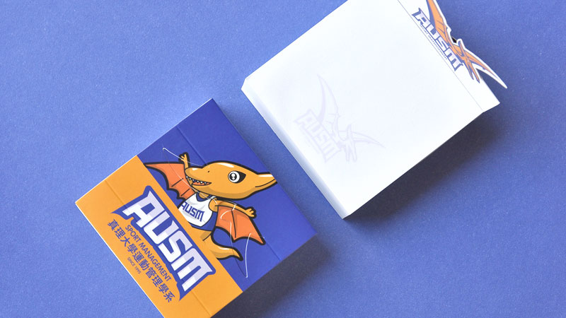
Note paper design detail
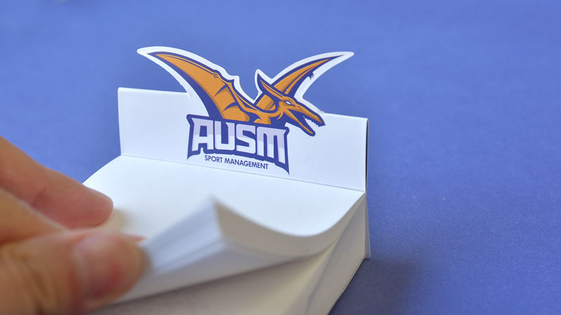
Note paper design detail
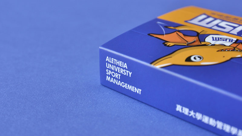
Note paper design detail
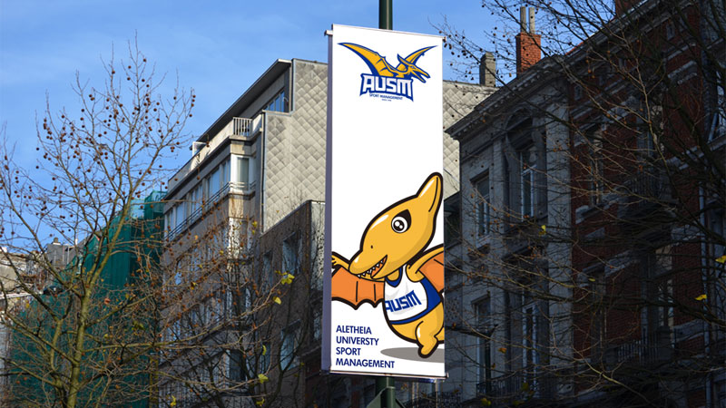
Flag design
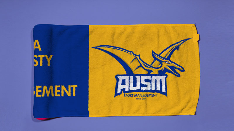
Towel design

Jersey design
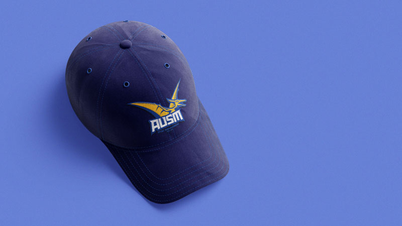
Hat design
真理大學運動管理學系
AUSM Sport ManAGEMENT
沿用原有LOGO設計之概念與色彩,在形體與視覺呈現上更加優化,並將系所的英文縮寫「S」、「M」融入在翼龍的形體之中,展翅張牙的姿態更彰顯系所的精神與野心。更延伸出翼龍的吉祥物角色,讓周邊商品與行銷活動的應用上更為廣泛。
The concept and color are derived from the original LOGO design, and then more optimized in form and visual presentation. "S" and "M" are integrated into the pterosaur form, and the posture of spreading wings and teeth is more prominent The spirit and ambition of the department. The pterosaur's mascot role is further extended, making the application of peripheral products and marketing activities more extensive.