PORTFOLIO
Logo
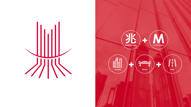
Logo concept
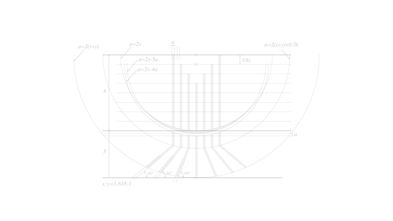
Logo sketch
Logotype
Supporting graphics

Primary color
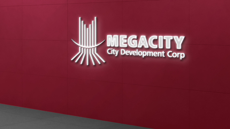
Primary usagen
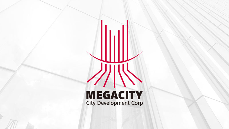
Logo
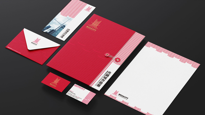
Stationery

Hard hat
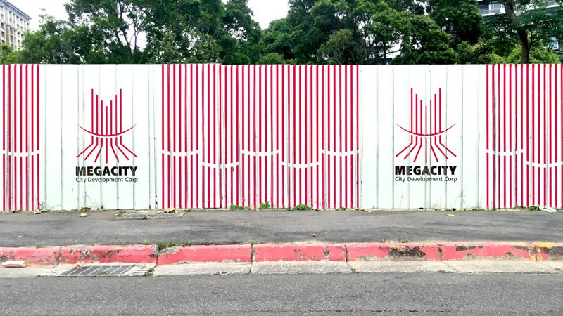
Construction fences
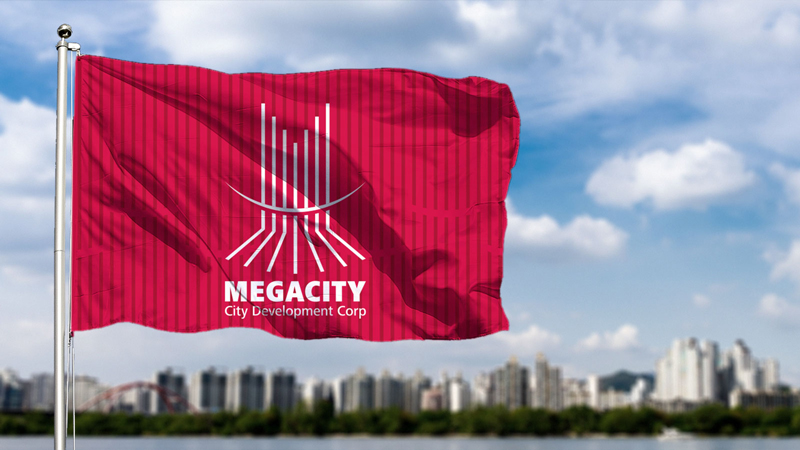
Flag
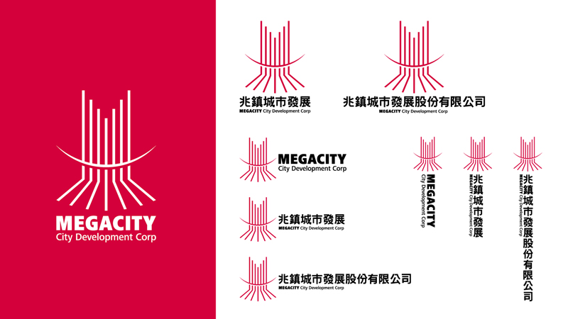
兆鎮城市發展股份有限公司
MEGACITY City Development Corp
以開頭中文字「兆」作為商標的主體,以視覺直接導入公司名稱——兆鎮城市發展股份有限公司。向上昇華的線條形成了英文字母「M」的符號就像是一棟棟幸福的大樓,也象徵著建造一個城鎮進而發展成一座城市的概念。水平穿越其中的橋梁則代表在建設的本質上,具備無往不利的溝通能力,進而為所有的居民打造出幸福美麗的家園。整體商標視覺呈現出向前的路線,也象徵著我們將建造一個人人都嚮往、目標明確的、不斷在進步的城市。
The main body of the trademark is the Chinese character "兆" at the beginning, and the company name is directly showed visually. The upward sublimated lines form the symbol of the English letter "M", which is like a happiness building. And also symbolizes the concept of building a town and then developing into a city. The bridge crossing it horizontally represents the essence of construction, which has the ability to communicate with no disadvantages, and then creates a happy and beautiful home for all residents. The overall logo visual presents a forward route, and also symbolizes that we will build a city that everyone yearns for, with clear goals and continuous progress.