PORTFOLIO
Logo
Loog concept
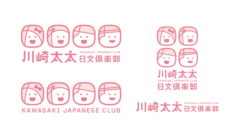
Loog and logotype type design by 岩永弥子
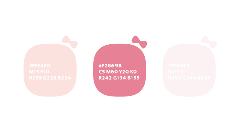
Primary color
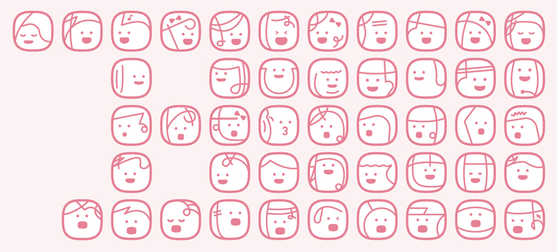
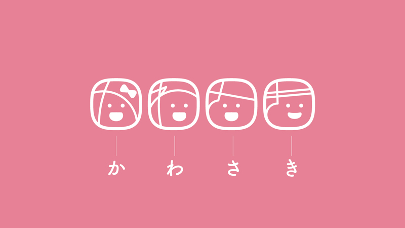
Japanese 50 Sounds
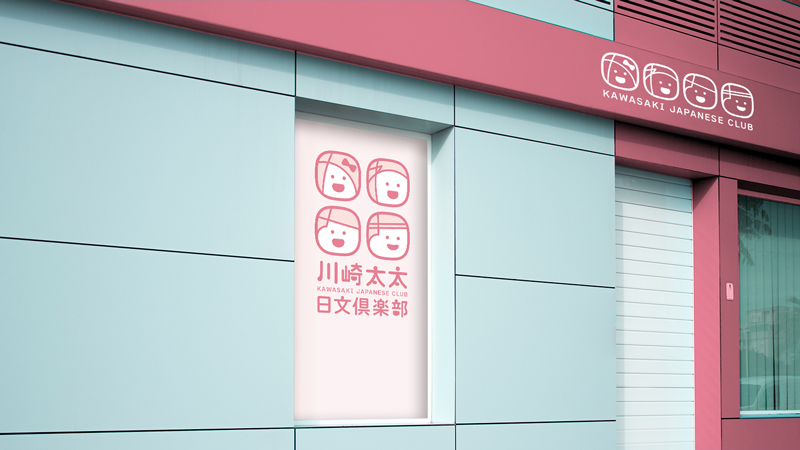
Sign
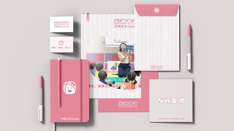
Stationery
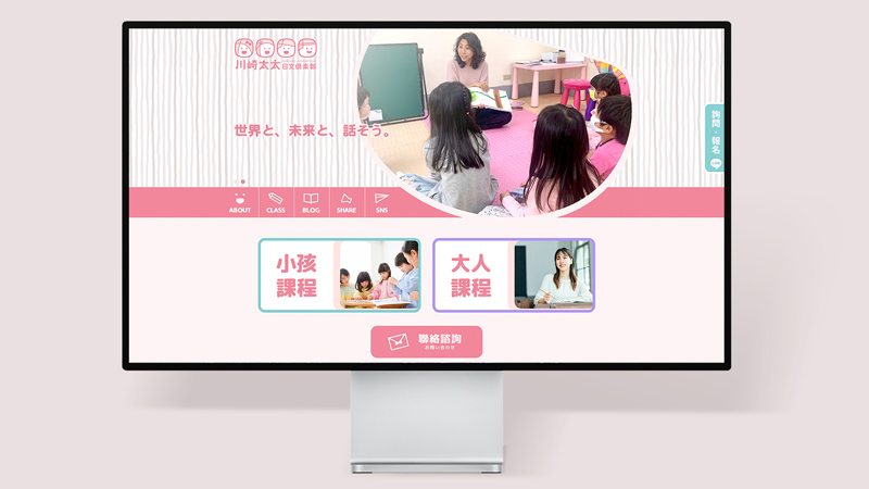
Web design
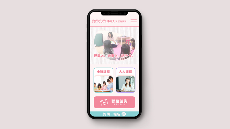
Web design
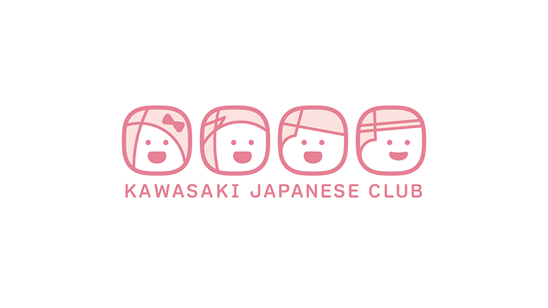
川崎太太日文俱樂部
KAWASAKI JAPANESE CLUB
透過將日文的「か (ka)、わ (wa)、さ (sa)、き (ki)」這些音節融入設計中,並結合俏皮的嘴型與表情呈現出可愛的角色,我們打造了這個迷人的標誌。其中的「か (ka)」字形象所呈現的瀏海與蝴蝶結裝飾更貼切地捕捉了川崎太太溫和親切的形象。這個標誌更象徵著兒童日文教育的溫馨和親切,進而強調友善的教學系統和環境。
By incorporating the Japanese syllables 'か (ka), わ (wa), さ (sa), き (ki)' into the design and combining them with a playful mouth shape and expressive character, we have created this charming logo. The image of the 'か (ka)' character is particularly representative, with its bangs and bow decorations, effectively capturing the gentle and amiable essence of Mrs. Kawasaki.This logo also symbolizes the warmth and approachability of children's Japanese language education, emphasizing a friendly teaching system and environment.