PORTFOLIO
Logo
Loog concept
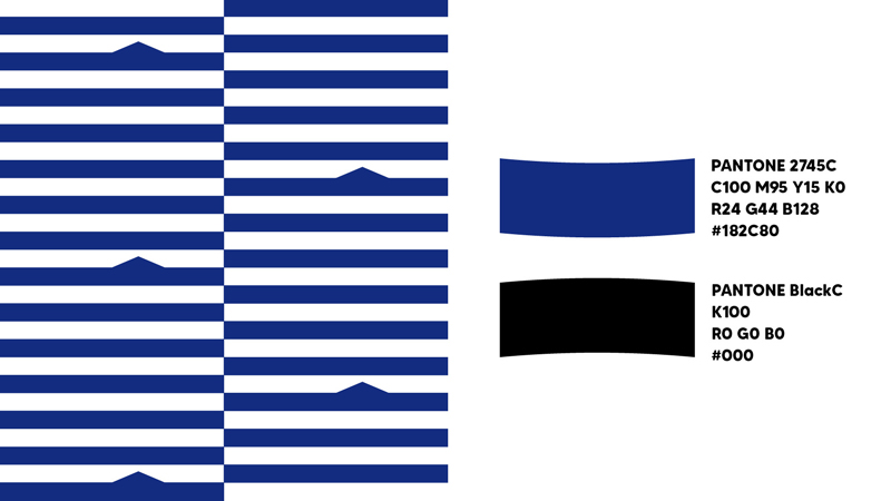
Primary color
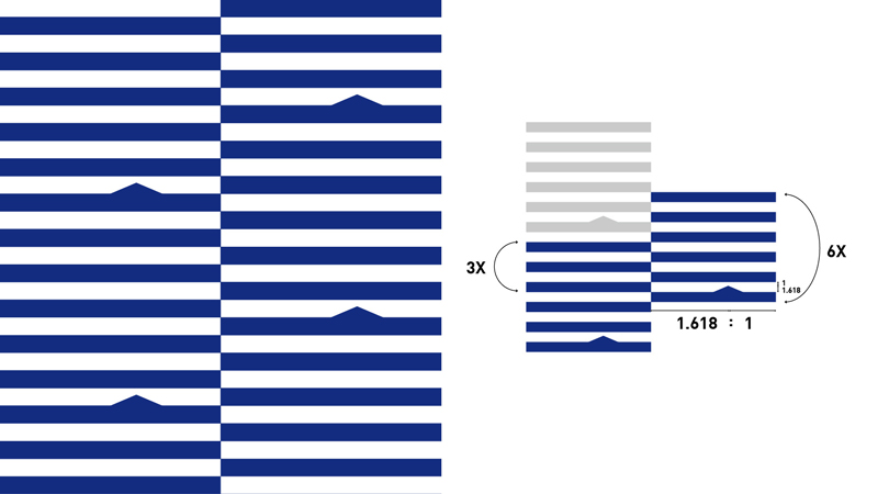
Supporting graphics
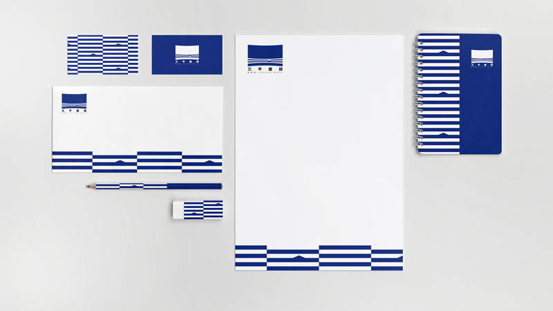
Stationery
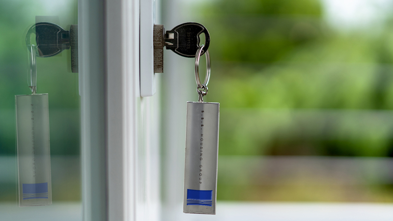
Key ring

Hard hat
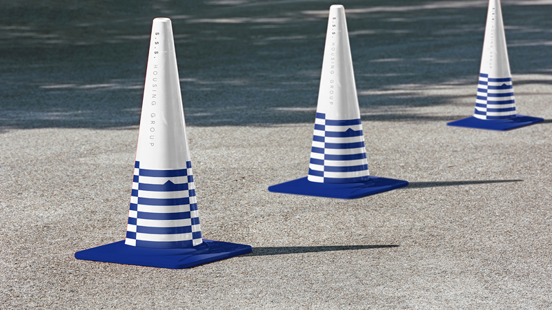
Cones
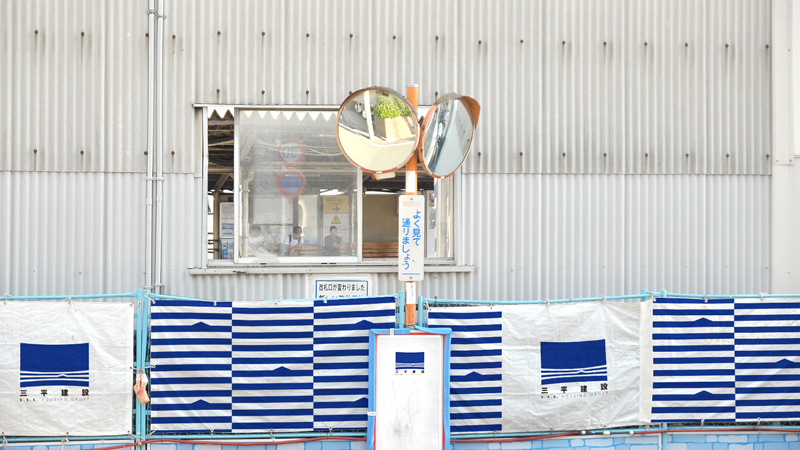
Construction fences
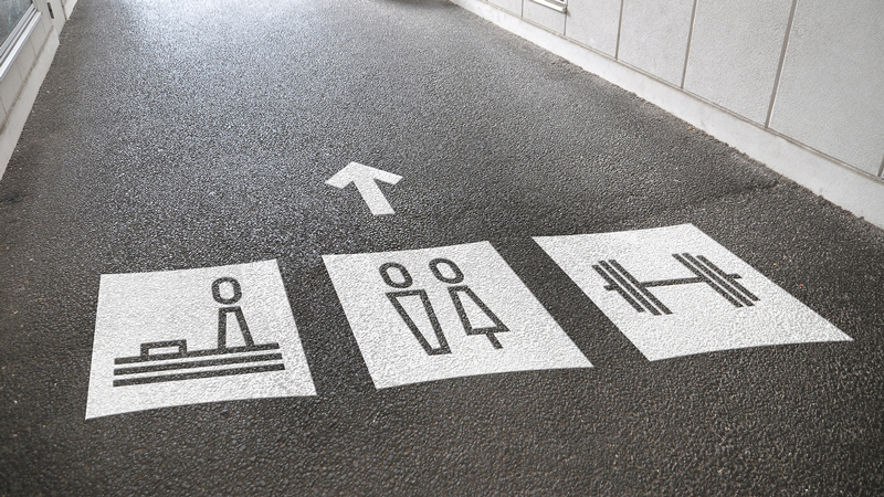
Icons
三平建設
S.S.S. HOUSING GROUP
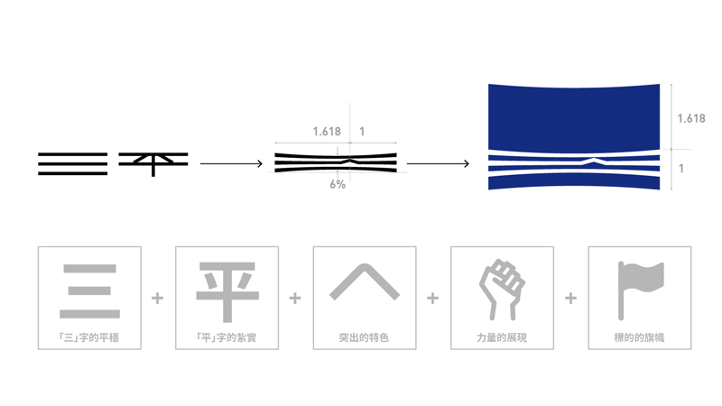
以「三」字平行線的平穩,「平」字向下扎根的紮實,其中將「平」字中間筆畫形成了向上符號,意味著具備突出的特色與不斷進步與前進的特點,向中心內縮的形體,象徵著力量的密度,也如同旗幟飄揚一般,駐點在各個力量飽滿的地點,為您建造堅固、實在、特色、美麗且充滿力量的建築。
The parallel lines formed by the word "三" are stable, and the word "平" is firmly rooted downward. Among them, the middle stroke of the word "平" is turned into an upward arrow, which means that it has the characteristics of outstanding and continuous improvement. The shape shrinking up and down towards the center symbolizes the density of power, and it is also like a flag flying. It is stationed at various places where energy is charged, and builds a solid, solid, characteristic, beautiful and powerful building for you.