PORTFOLIO

Logo
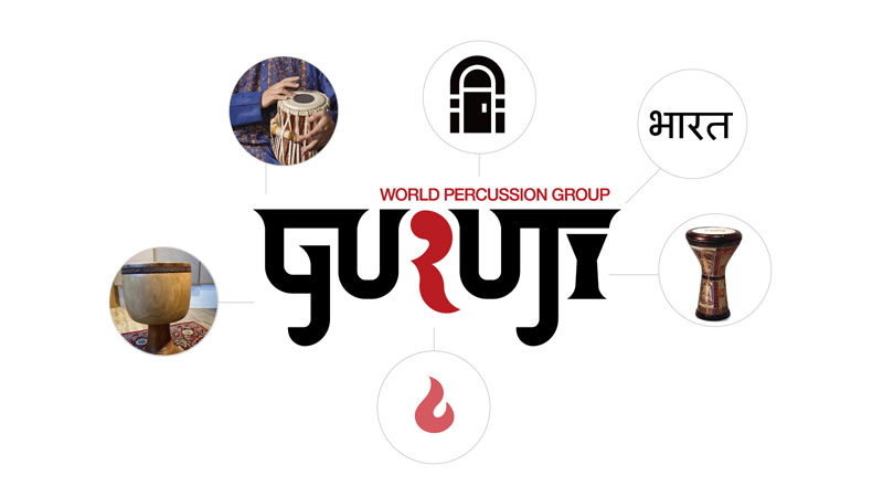
Loog concept
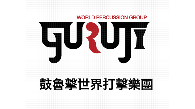
Logotype
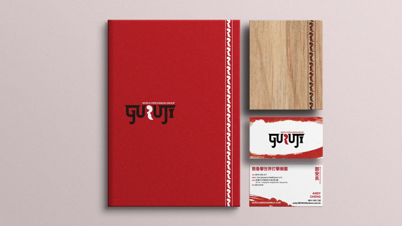
Stationery
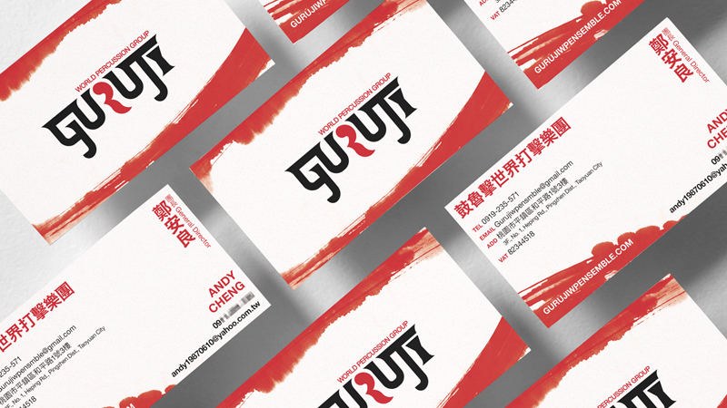
Business card
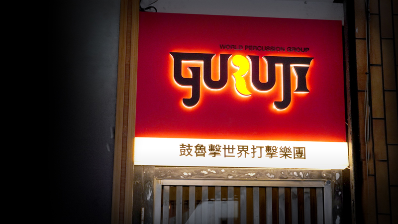
Sign board

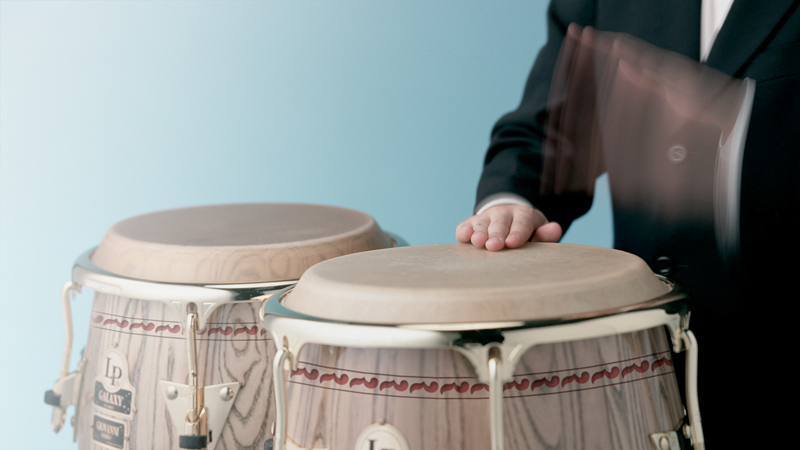
Tshirt
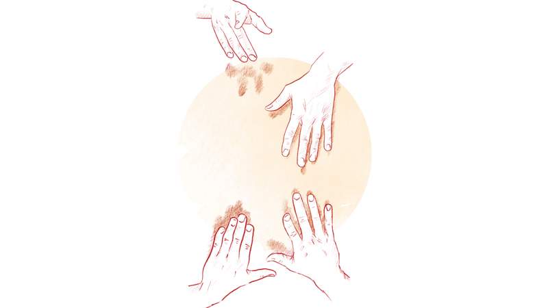
Graphic
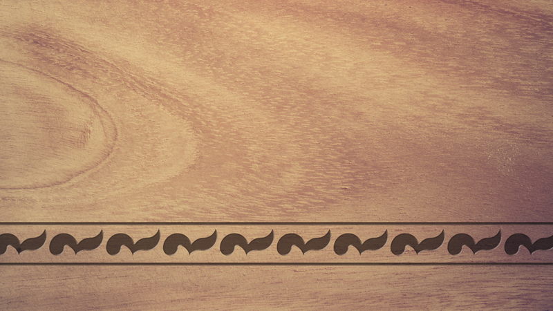
Pattern
Pattern
鼓魯擊世界打擊樂團
GURUJI WORLD PERCUSSION GROUP
鼓魯擊世界打擊樂團LOGO設計以GURUJI英文字樣為基礎,其品牌名稱源於印度文「老師」的意思,在形體之中的帶出印度文的氣氛,字架間穿插著不同的打擊樂器於其中,對望的兩個「U」字象徵著人與人的交流而形成的一扇大門,也象徵著老師與學生的交流,代表打擊樂熱情的紅色「R」字以不同的形體出現,代表的文化的多元融和,並且跳脫於旁邊較為整齊的字體,象徵著在音樂節奏之中凸顯出來的靈魂,也象徵著多種不同文化的融和與發散。
The LOGO design of the GURUJI World Percussion Orchestra is based on the English word "GURUJI". Its brand name comes from the Indian word "teacher", which brings out the Indian atmosphere in the shape. Among them, the two "U" characters facing each other symbolize a door formed by the communication between people, and also symbolize the communication between teachers and students. The red "R" character representing the enthusiasm of percussion appears in different shapes. It represents the diversity and fusion of cultures, and it jumps out of the neater fonts next to it, symbolizing the soul highlighted in the rhythm of music, and also symbolizing the fusion and divergence of many different cultures.